Netflix Dashboard
Gamification and Social Profile Concept
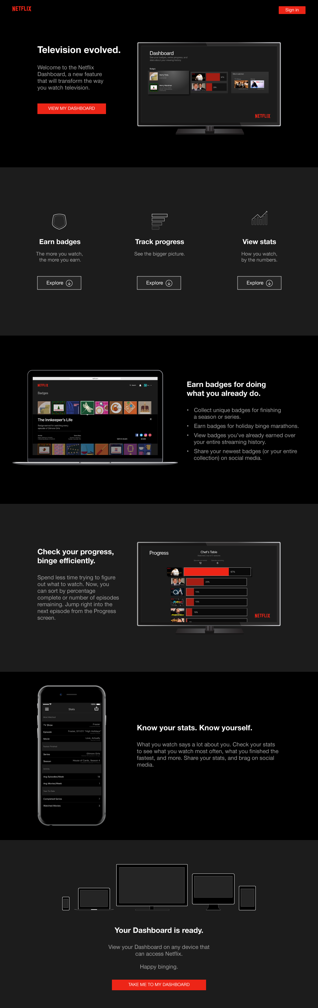
I came up with an idea for new Netflix features: What if you could earn badges for watching content, track progress of content you're actively watching, view stats about what you watch most often, and share it all on social media? I designed a mockup of the "Netflix Dashboard," which houses all of these features.
Disclaimer: This was a self-initiated project, and I am not affiliated with Netflix. I love watching television, and I used this as an exercise to design and illustrate a concept that I want as a user.
Project Overview
Design a landing page to showcase the new Netflix Dashboard features, including the following:
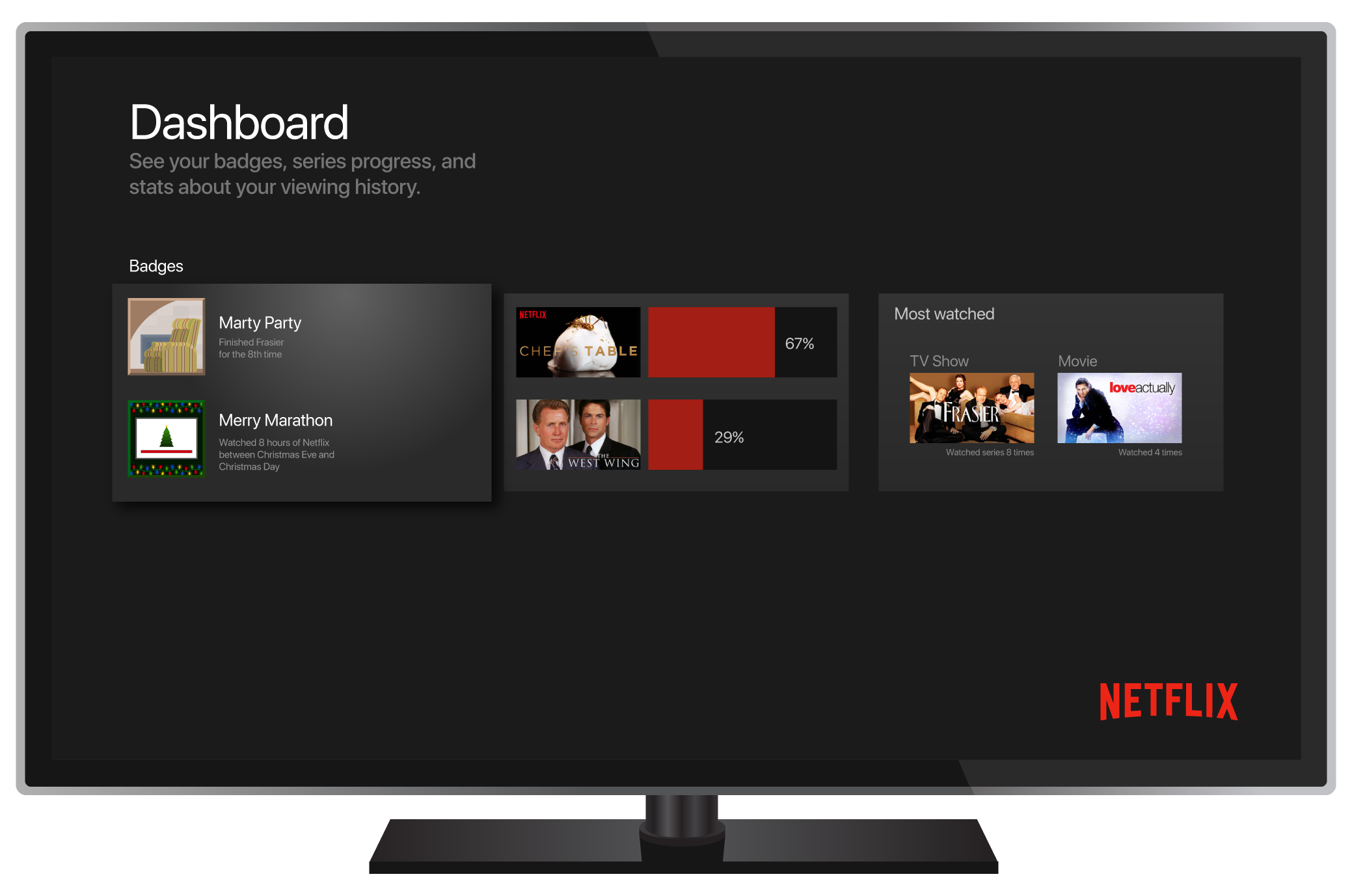
- Dashboard screen, where the user can access Badges, Progress, and Stats
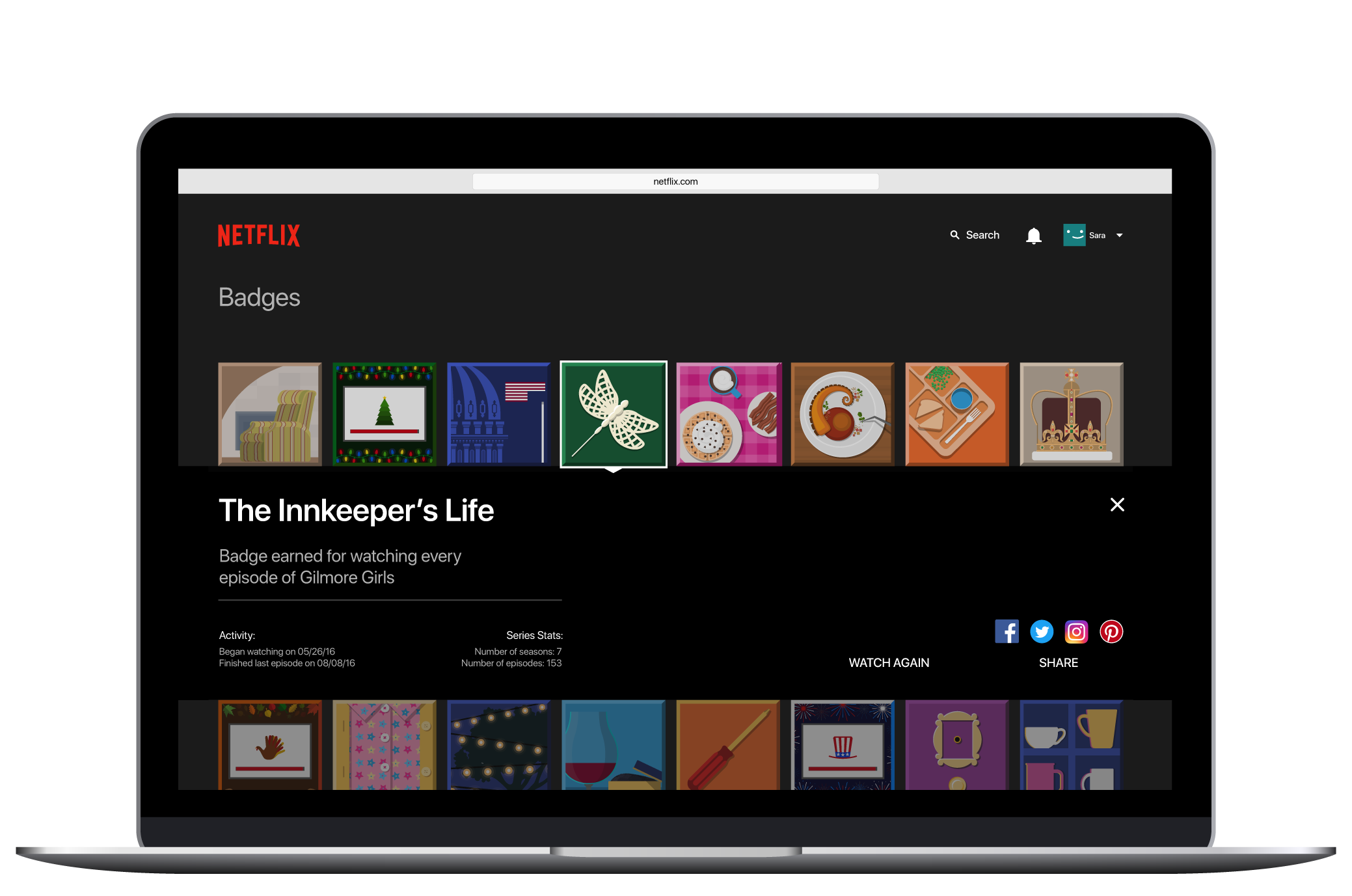
- Badges screen with illustrated badges
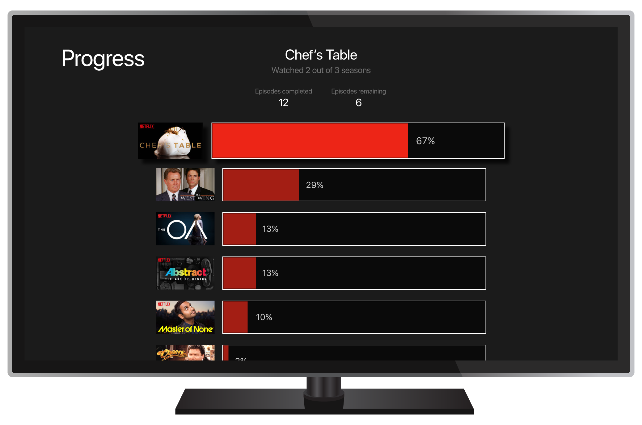
- Progress screen showing percentage completion for multiple shows
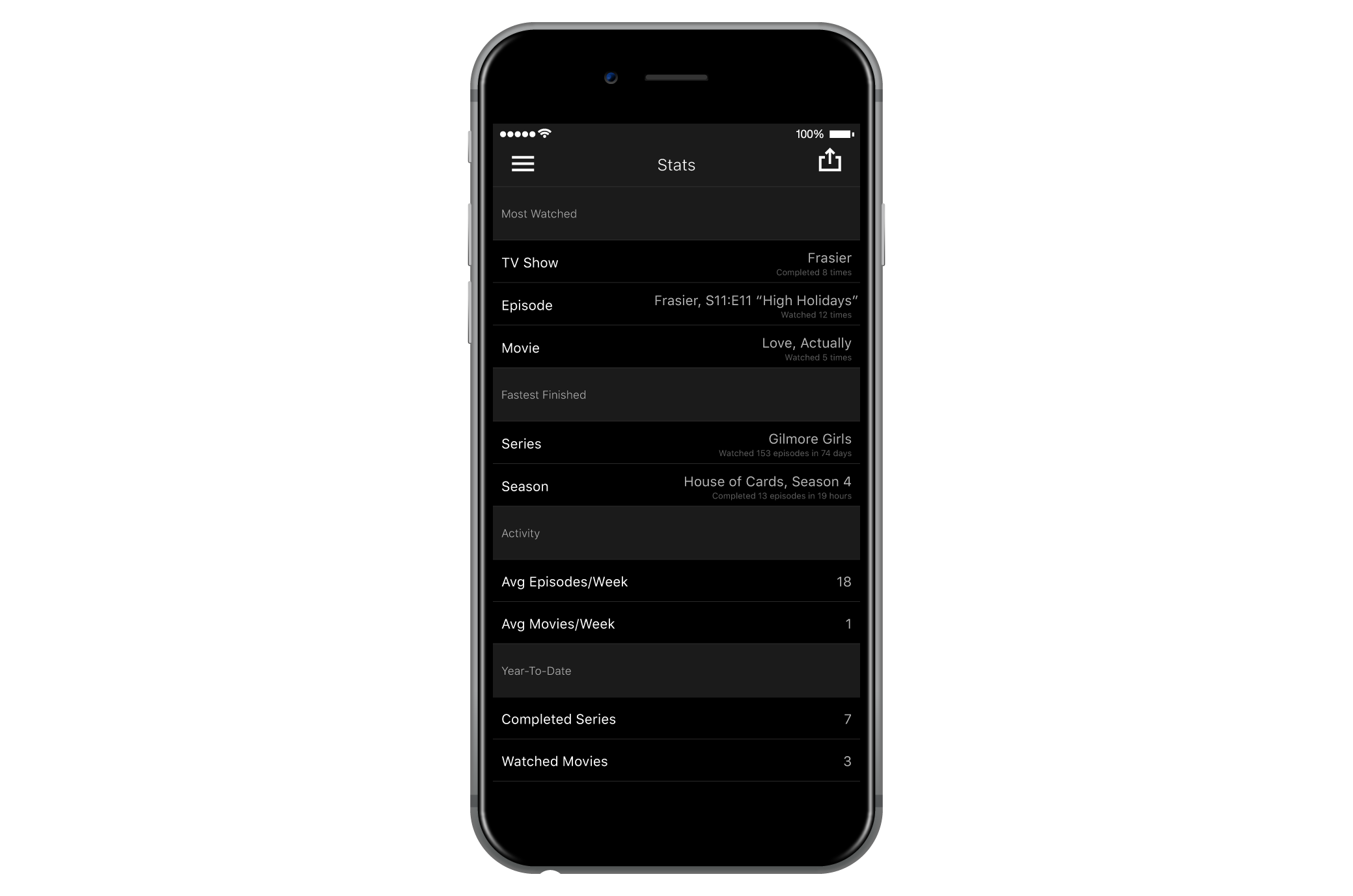
- Stats screen showing frequently watched and fastest finished content
Target audience: Existing and potential Netflix users.
Goals: Increase Netflix brand awareness, promote original content, new user acquisition.
Step 1: Illustrate badges
The most exciting part of this project for me was getting to illustrate unique badges for shows that I love. I started by researching badge systems, and I experimented with color palettes and badge shapes. Although I love the idea of using color to unify the badges as one family, it felt more important that each badge's colors represent its specific television show.
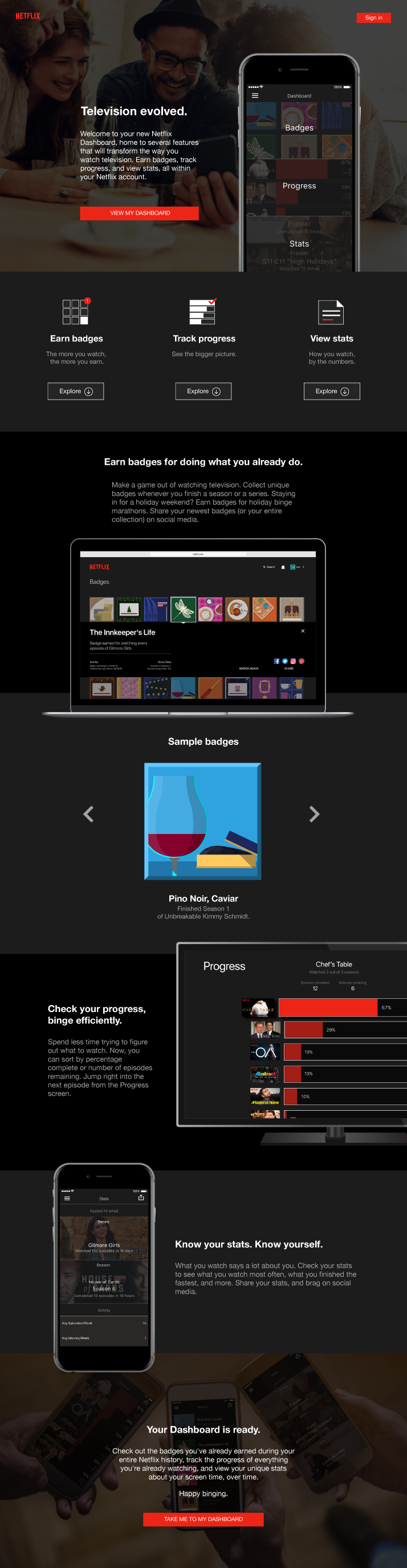
First draft vs. final draft of the Gilmore Girls badge (The Innkeeper's Life). My first badges had white rounded frames casting shadows on inner illustrations.
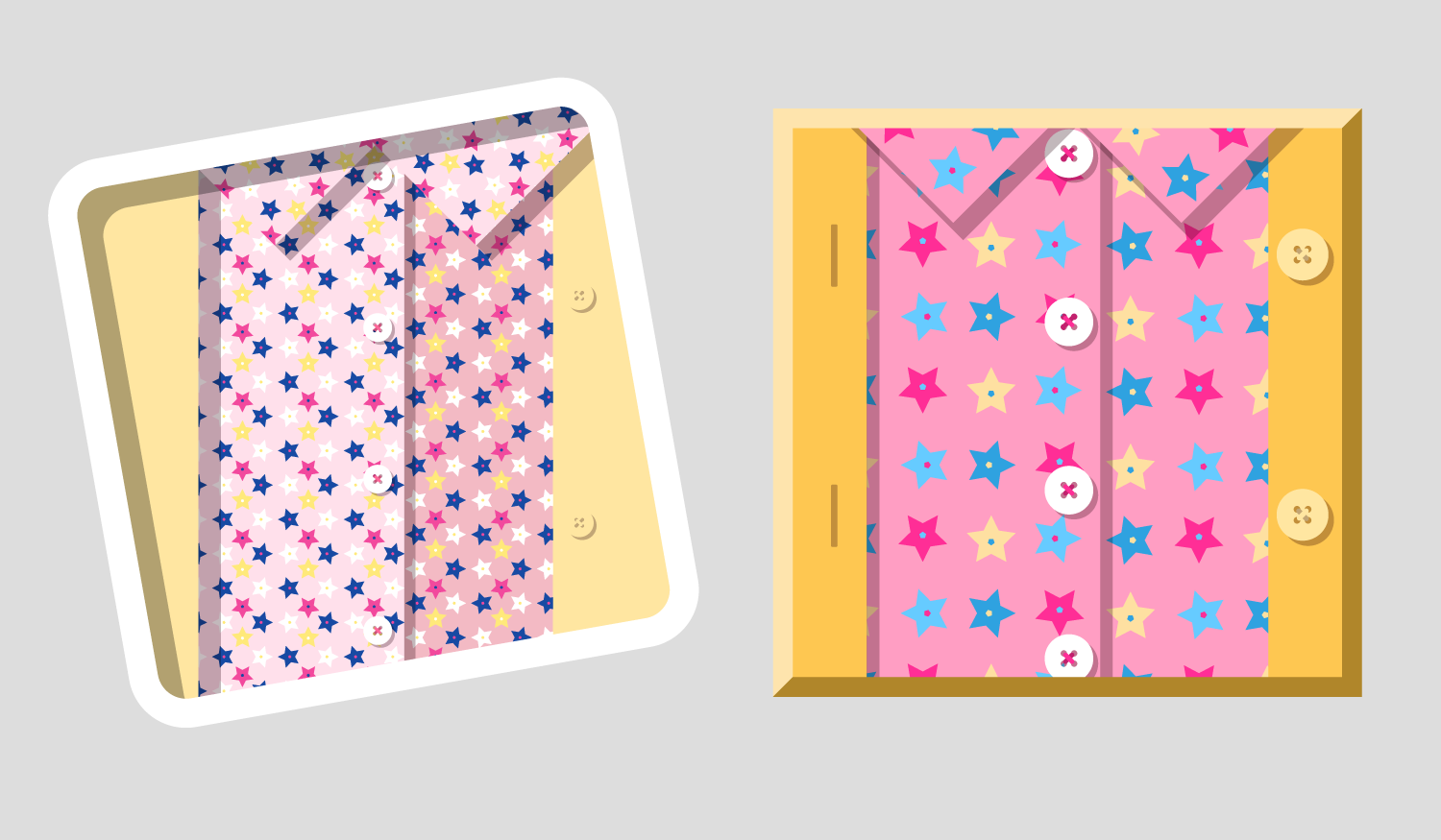
In the earlier version of this Unbreakable Kimmy Schmidt badge, I was experimenting with muted colors and tilting the badge angle.
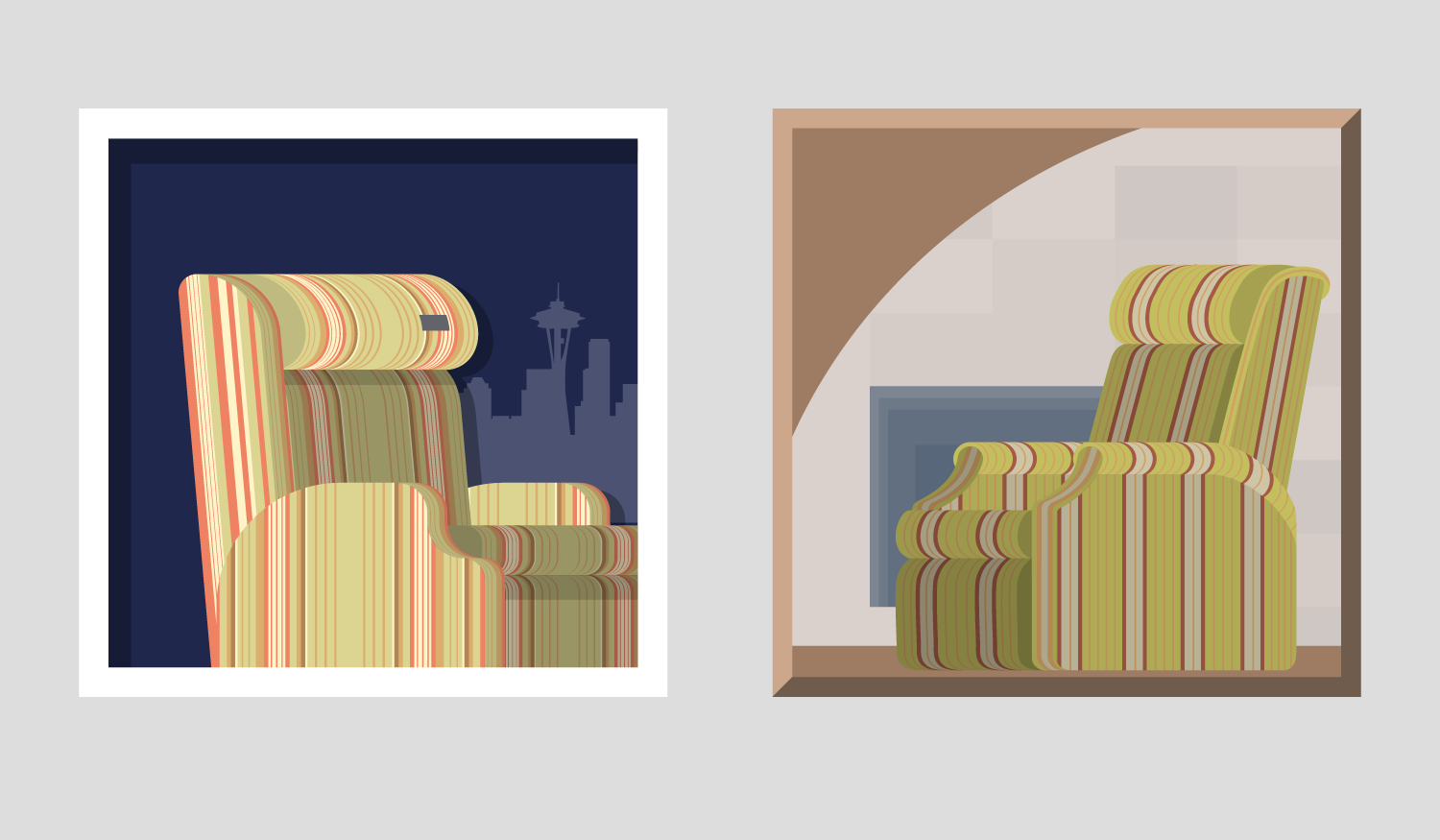
My earlier Frasier badge (Marty Party) shows the evolution from round to square corners. In the final version, the chair's pattern is more defined, and the background is Frasier's fireplace instead of the Seattle skyline.
Here are the 16 badges I created for this project:

Pino Noir, Caviar
Finished Season 1 of Unbreakable Kimmy Schmidt.
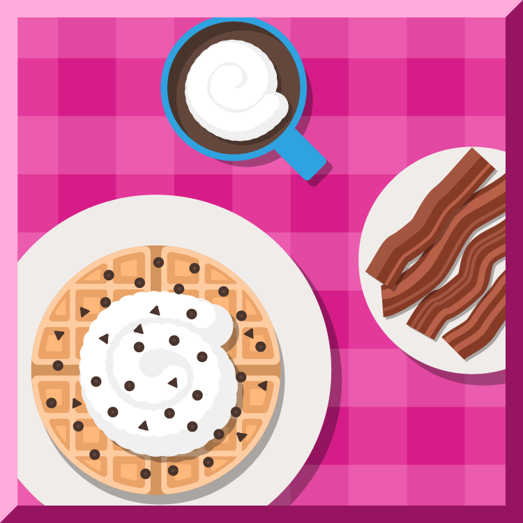
Hashbrown, No Filter
Finished Season 2 of Unbreakable Kimmy Schmidt.

Stack the Deck
Finished Season 4
of House of Cards.

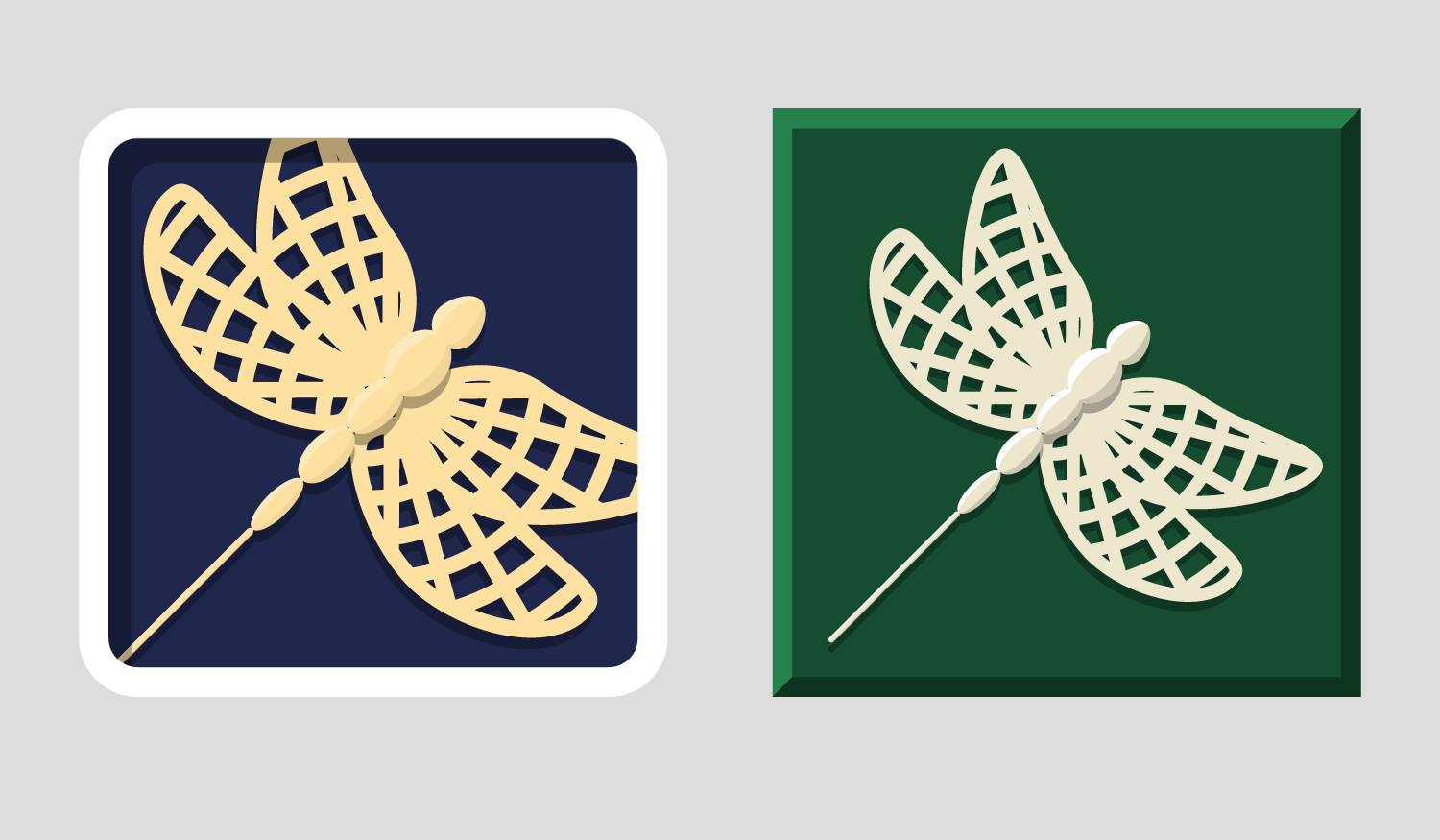
Multi-purpose Tool
Finished Season 1 of Orange is the New Black.

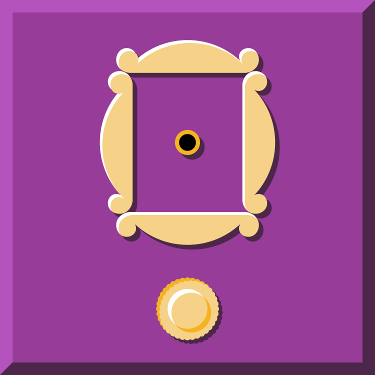
The Innkeeper's Life
Watched all 7 seasons of
Gilmore Girls.
Queen of the Kitchen
Finished Season 3 of Orange is the New Black.
Merry Marathon
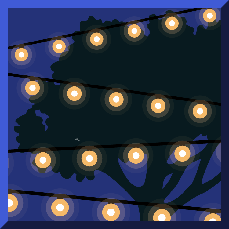
Watched 8 hours of content between Christmas Eve and Christmas Day.

True Patriot
Watched 8 hours of content on July 4th.

Feast Your Eyes
Watched 8 hours of content on Thanksgiving weekend.
The Last Four Words
Finished Gilmore Girls: A Year in the Life.
Team Braverman
Watched all 6 seasons of Parenthood.
The One With the Badge
Watched all 10 seasons
of Friends.
Breakfast of Champions
Watched all 7 seasons of
Parks and Recreation.

Heavy is the Head
Finished Season 1
of The Crown.

Holy Mole Madre
Finished Season 2
of Chef's Table.
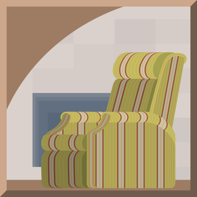
Marty Party
Watched all 11 seasons
of Frasier.
Step 2: Design UI
I studied the differences in the existing Netflix UI on my laptop, phone, and Apple TV. Instead of designing how each new feature would look on all devices, and because my end goal was a landing page, I focused my efforts on where a user might be most likely to enjoy each of the new features. I decided that my landing page should feature the Dashboard on a television, the Badges on a laptop, Progress on a television, and the Stats on a phone.
Step 3: Design Landing Page
When designing the landing page, I wanted to use the Dashboard as the hero image, and provide more clarity about the new features that live inside it in separate sections below. Finally, my landing page would culminate with a call to action letting the reader know that the Dashboard is ready and waiting for them in their existing Netflix account, and available on any device that they use to access Netflix.
Step 4: Solicit feedback
I showed my landing page to a few friends that were also Netflix users. I noticed that the majority of them hesitated at first. They didn't really understand the concept within the first few seconds. Once I explained my idea to them further, they were enthusiastic and continued to read down the page but would eventually stop somewhere in the middle. One of my brilliant designer friends gave me great constructive feedback:
- The call to action sections at the top and bottom were not exciting enough.
- The CTAs didn't clearly explain what the user would get by clicking the buttons.
- The value prop illustrations were too plain.
- Not enough attention was given to Badges, which were the prizes to be collected by the user.
- The layout was cut into sections that were too perfect with padding that did not invite the user to continue scrolling.
- The Stats UI did not look as fun or friendly as the others.
So I went back to work.
Step 5: Revise and code
To make the top CTA more exciting, I used a photo of friends gathered around a phone. This mirrors the idea that the Dashboard and the features within it make Netflix more social. And to drive it home further, I swapped the television with the Dashboard UI for a phone. For the bottom CTA, I used a photo of three hands holding their phones together, each representing one of the three sections of the Dashboard: Badges, Progress and Stats.
I adjusted the copy of the top and bottom sections to explicitly mention Badges, Progress, and Stats. At the bottom, I try to entice the reader to click the button by telling them that they already have a collection of Badges, Progress for shows they're currently watching, and Stats about their entire viewing history waiting for them in their Netflix account.
I made the value prop illustrations bolder and added a pop of red to each as a callback to the the Netflix logo.
I split the Badges section into two sections. This allowed me to increase the size of the laptop and also add a carousel of sample badges with their names and descriptions.
To invite the user to continue scrolling, I repositioned the devices so they would overlap the sections below them.
When I revisited the Stats section, I increased the breathing room of each entry and included transparent Netflix title cards. I liked the style much more, so I used the same style for the Dashboard UI at the top and in the photo of the phones at the bottom of the page.
I am so much happier with the final version than the first, and I am so grateful for the constructive feedback I received.
My final step was to code it. Click here to see it live.